Industry Insights
How Visual Communication Brings Users Closer to Data

Laurel Fox
Laurel helps organisations to navigate the journey between business requirements and flexible, quality solutions with the right technology. She is committed to developing solutions that improve overall end-user productivity, drive connectivity and create value. With qualifications in IT as well as visual communications, Laurel applies her knowledge and experience to deliver positive customer and user experiences with every solution.
August 20th, 2021
Do you remember what it was like before we had intuitive search engines? Searching for information was a time consuming and esoteric activity. To search effectively it was necessary to have an understanding of how databases and database queries worked.
Nowadays, we experience similar frustrations when solutions are not designed with our needs in mind.
In the data world, this can be equated to trying to gain vital insights from 30 different reports which each present information in their own way. For time-poor professionals, trying to derive insights from these reports to make business-critical decisions can be near impossible.
Fortunately, there has been a significant and welcome shift in recent times to understanding the value of user experience and designing in a way that caters specifically to it. Otherwise known as UX design or user experience design, this is particularly important in the tech industry where adoption is key to success.
At Antares, we take users’ needs very seriously and make time before any new data project to properly elicit every user’s needs.
We do this by bringing specific user groups together to ask questions, such as:
• Who will use the data?
• How do you currently access data sources?
• What do you need the data to show you?
• What current (or previous) pain points are you experiencing?
• How critical is the information to your role?
• How often will you need to access the data?
By engaging with a variety of stakeholders and gauging what success looks like to them, we gain a better understanding of how best to approach the project.
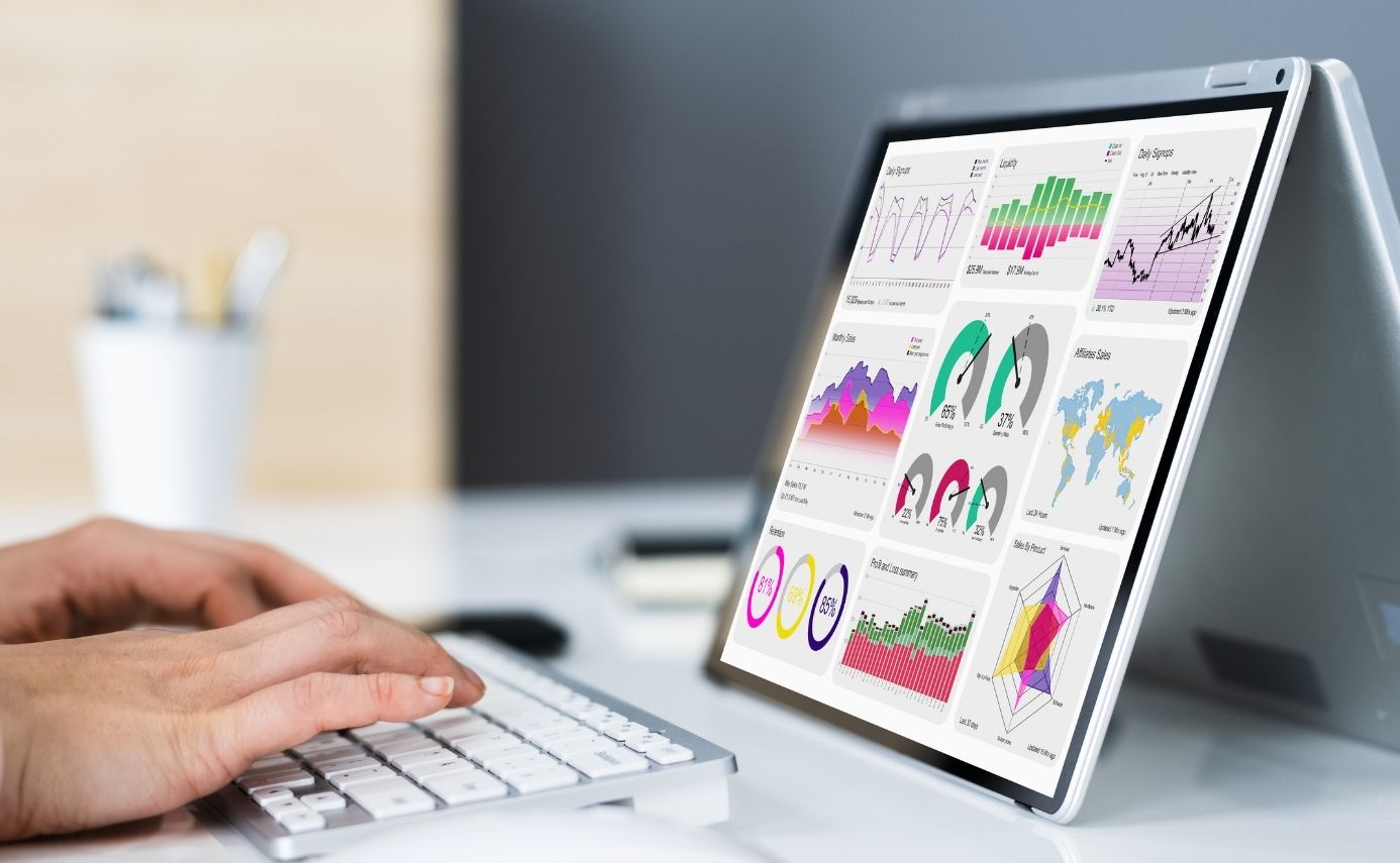
Dashboard design is vital to success
In building out any new data capability, dashboards (the place where data is presented) are paramount to user success. This is where data results are served up in a visual format so users can interpret the information and make decisions to improve their business.
People who rely on data for decision making don’t need to know what’s going on behind the scenes – they only need to know that the results they are seeing are accurate and can be trusted.
Designing a great dashboard requires a mix of UX design, psychology, and creative and technical ability. You essentially need to communicate complex concepts in an intuitive and visual way to help people distil information quickly.
Many of us don’t realise that (on a cognitive level) we actually build relationships with the interfaces we use every day. A good user experience creates trust and advocacy, which helps boost user adoption to drive a business to a new level of technological maturity.
On the flip side, a bad user experience forces people back to tools such as spreadsheets where they feel comfortable and safe – ultimately keeping the business stuck in a time warp and eliminating the chance of achieving a return on investment.
Leveraging a common visual language
In an era where people are having to learn new technologies every day, adoption fatigue is common and something every business should seek to avoid through attention to user experience.
When it comes to your data dashboard, this means presenting visual information in a clean, clear and consistent way.
One way we do this is by leveraging a common visual language. For example, life experience tells us that “green” means go or good and “red” means stop or bad. Certain shapes, fonts and styles also elicit a sub-conscious reaction from users which should all be accounted for in a quality dashboard design.
Another important aspect is user interaction. We expect to see certain functions in certain places because we’ve learned this from prior experience. For example, most websites follow a common template in terms of navigation, menus, buttons, and search functionality. In designing a dashboard, you want to replicate these to cater to a user’s natural instincts.
An understanding of pre-attentive processing and psychology is crucial in the overall design of a dashboard. Dashboard designers should consider:
• Information hierarchies
• Appropriate visualisations for the data being displayed
• Accessibility
• Design principles such as balance, emphasis, proportion and harmony.
Our goal is to make a user’s experience as simple and logical as possible to reduce cognitive load and invite user curiosity which is essential for businesses that want to make the most of their data.
Ultimately, every new data project requires close attention to visual communication and design. By making life easier for the user, we have the best chance of ensuring that they will get the maximum benefit and value from the solution and the business insights that it can provide.
To learn more about how Antares can assist with data visualisation and dashboards for your reporting, simply contact us.